Teaespresso
Packaging Design for IDocean Co., Ltd.
Reddot Creative has applied the Flat Illustration style, also known as Flat illustration, a minimalist style, limited details, effects when designing Teaespresso packaging. Reddot wanted to keep it simple and balance the details, colors, and main layout when developing the artwork for the tea label. Each tea box is a story of origin, its own taste with exquisite design, but when you order 3 boxes of tea with the same product line, they will combine into an overall picture that attracts customers’ eyes.
Download Press Kit № 146456
Download Press Kit № 146456 Packaging Design for IDocean Co., Ltd. by Reddot Creative to access high-res images, essential texts, translations, and exclusive interviews—all in one.
Available Now for Your Next Story
At communication|newsroom, we understand the pressures and deadlines journalists face. That’s why we offer exclusive access to our curated press kits and high-resolution images, tailored for accredited journalists. These resources are designed to enrich your stories with depth and visual appeal, spotlighting the world's most innovative designs.
Please Note:
- Credit the work's creator and/or photographer.
- Mention communication|newsroom as your source.
- Share your published pieces with us; we love to celebrate and promote your work on our platform and social media.
Let’s Collaborate: Your stories matter. communication|newsroom is here to support you with quality, accessible content. Once you are accredited, reach out for the images and content you need. We will provide the specific images and content directly, along with recommendations on works to feature.
Get Accredited Easily: Quick access to our resources requires media accreditation. Apply for media accreditation to join our network and start exploring a wealth of design stories.
Teaespresso by Reddot Creative
Download 1800 Pixels JPEG Image.
Packaging Design by Reddot Creative
Download 1800 Pixels JPEG Image.
Reddot Creative Teaespresso
Download 1800 Pixels JPEG Image.
Reddot Creative Packaging Design
Download 1800 Pixels JPEG Image.
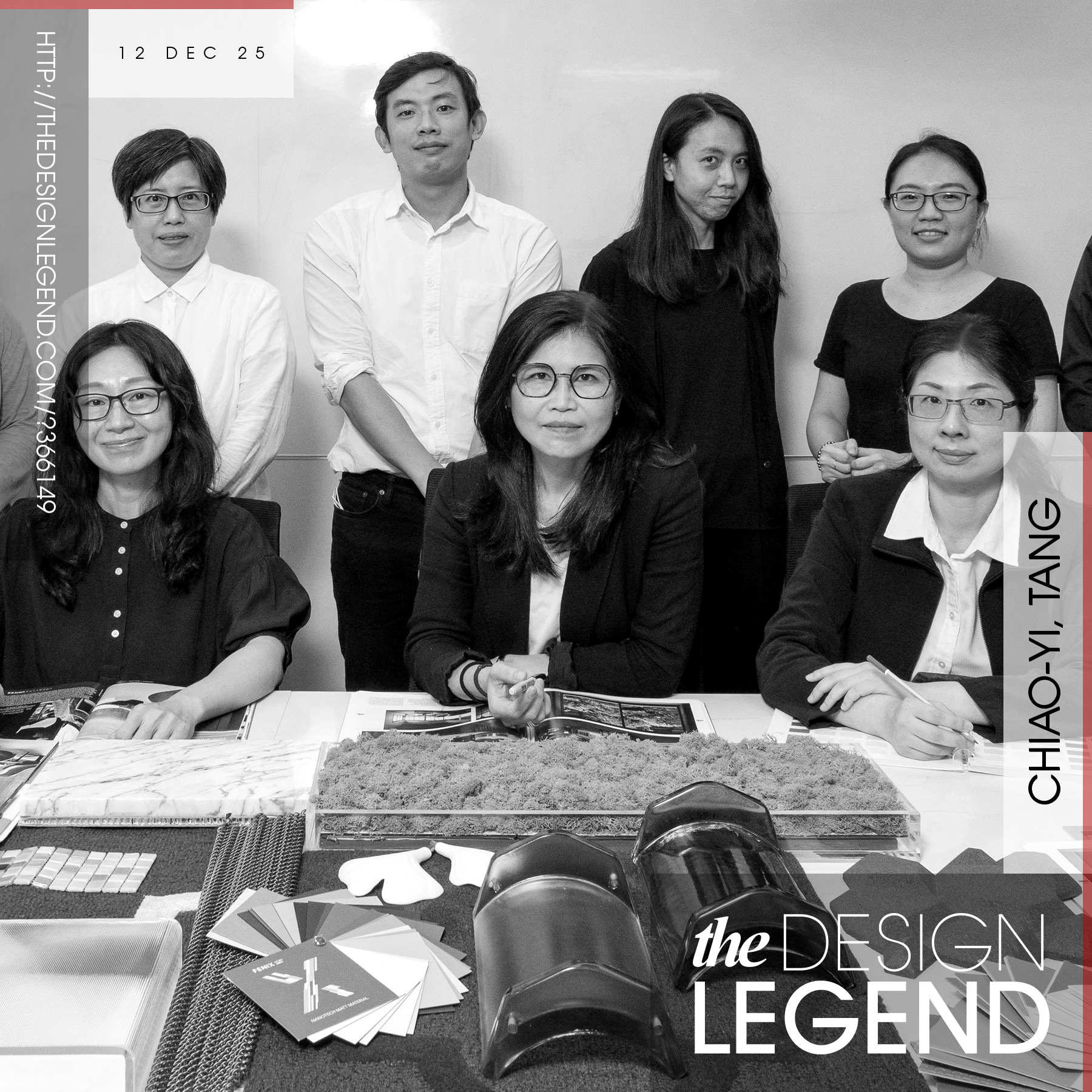
Reddot Creative Design Team Photo
Download 1800 Pixels JPEG Image.
IDocean Co Ltd Brand Logo
Download 1800 Pixels JPEG Image.
Teaespresso Packaging Design Press Releases
Availability alert: Press releases for Teaespresso in languages including English.
Teaespresso Packaging Design Media Articles
Our articles on Teaespresso, prepared for immediate use, are offered in several languages, including English, Spanish, French, Italian, German, Chinese (Mandarin), Dutch, Portuguese, Indonesian, Japanese, Turkish, Korean, Russian, Arabic (Standard) and Hindi.
Unique Properties
IDOCEAN want the packaging to create a unique mark for the Teaespresso tea bag product line with feelings about high-end products. In addition, due to the Teaespresso brand, there will be many different product lines that require a common concept for the packaging of all these product lines. Reddot Creative has told the story of the origin and flavor of Teaespresso tea lines by illustrating scenes from tea hills in Taiwan, Japan, Srilanka to British tea parties. Reddot Creative has applied the Flat Illustration style, also known as Flat illustration – a minimalist style, limited details, effects when designing Teaespresso packaging. “We wanted to keep it simple and balance the details, colors, and main layout when developing the artwork for the tea label. Use bright, contrasting colors to make artwork stand out, the color range is cleverly processed to bring sophistication but still attractive and attractive and keep all clean and clear. Each tea box is a story of origin, its own taste with exquisite design, but when you order 3 boxes of tea with the same product line, they will combine into an overall picture that attracts customers’ eyes.
Tags
Tea packaging, Illustration, Creative, Flat Design, Tea
Production Technology
Four color printing, high quality paper, profiling, matt lamination high quality paper, profiling, matt lamination and logo is gold emulsified to increase the luxury. Design: Flat Illustration style, also known as Flat illustration – a minimalist style, limited details, effects.
Design Challenge
Teaespresso is a brand of tea bags belonging to Idocean food ingredients company, this is a product that is positioned in the high-end segment and our client: Idocean want the packaging to create a unique mark for the Teaespresso tea bag product line. In addition, due to the Teaespresso brand, there will be many different product lines that require a common concept for the packaging of all these product lines.
Project Duration
The project started in April 2022 and finished in September 2022, public in 2023
Operation Flow
We wanted to keep it simple and balance the details, colors, and main layout when developing the artwork for the tea label. Use bright, contrasting colors to make artwork stand out, the color range is cleverly processed to bring sophistication but still attractive and attractive and keep all clean and clear. Each tea box is a story of origin, its own taste with exquisite design, but when you order 3 boxes of tea with the same product line, they will combine into an overall picture that attracts customers’ eyes
Research
Client want the packaging to create a unique mark for the Teaespresso tea bag product line with feelings about high-end products. Applied the Flat Illustration style, also known as Flat illustration – a minimalist style, limited details, effects when designing Teaespresso packaging. We wanted to keep it simple and balance the details, colors, and main layout when developing the artwork for the tea label. Use bright, contrasting colors to make artwork stand out, the color range is cleverly processed to bring sophistication but still attractive and attractive and keep all clean and clear.
Inspiration
the story of the origin and flavor of Teaespresso tea lines by illustrating scenes from tea hills in Taiwan, Japan, Srilanka to British tea parties.
Image Credits
Image credits: Reddot Creative
Project Overview
Teaespresso Packaging Design has been a Bronze winner in the Packaging Design award category in the year 2023 organized by the prestigious A' Design Award & Competition. The Bronze A' Design Award is given to outstanding designs that showcase a high degree of creativity and practicality. It recognizes the dedication and skill of designers who produce work that stands out for its thoughtful development and innovative use of materials and technology. These designs are acknowledged for their professional execution and potential to influence industry standards positively. Winning this award highlights the designer's ability to blend form and function effectively, offering solutions that enhance people's lives and wellbeing.
Bronze Recognition
Reddot Creative was recognized with the coveted Bronze A' Design Award in 2024, a testament to excellence of their work Teaespresso Packaging Design.
Reddot Creative Press Releases
Discover Reddot Creative's journey through our press releases, available for all press members and journalists to use without restrictions. Journalists, gain instant access to 1 press releases today.
Reddot Creative Unveils Innovative Teaespresso Packaging Design
Reddot Creative introduces the Teaespresso packaging design, a visual journey through the origins and flavors of the tea lines, set to launch in 2023.
Reddot Creative Newsroom
Unlock a treasure trove of award-winning designs by accessing Reddot Creative Newsroom.


